
In the rapidly growing world of data analytics, hands-on projects are the best way to enhance your skills and make your resume stand out. One such project is building an End-to-End Data Analysis Project using Power BI with a real-world application like PhonePe.
In this blog, we’ll walk you through how to create a PhonePe Data Analysis Dashboard. This project covers all the essential data analysis aspects such as transaction tracking, failed payment monitoring, and visualizing multiple services like Insurance, Loans, Money Transfers, and Recharge & Bills. It’s an excellent opportunity to gain practical experience in Power BI and showcase your skills to potential employers.
1. Understanding the Project Structure
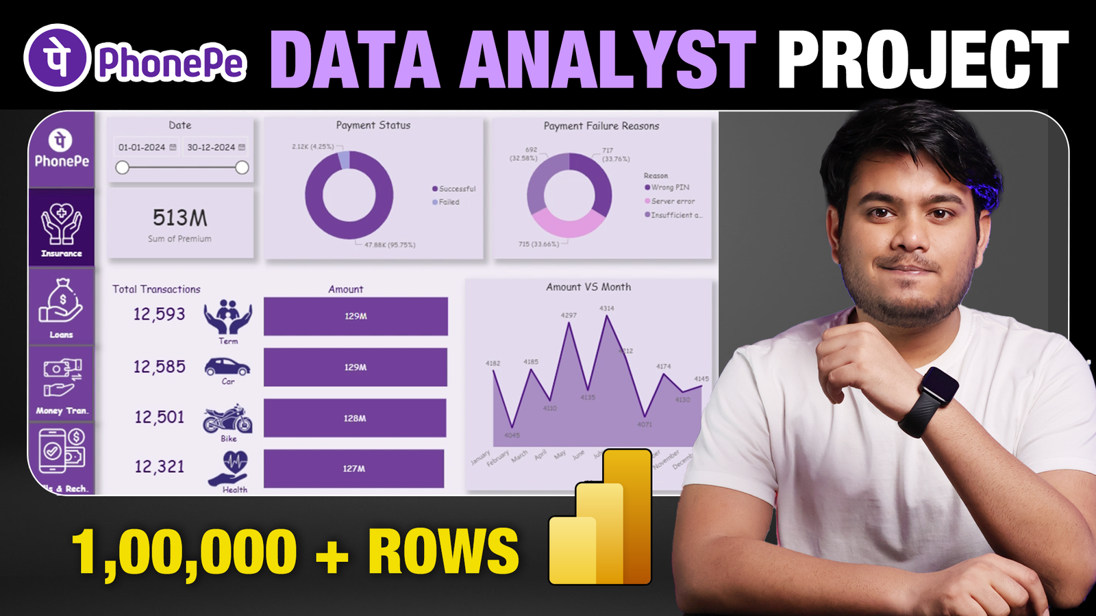
Our PhonePe Data Analysis Project revolves around creating a 5-page Power BI dashboard that displays various transaction and service metrics. The primary goal is to track the following key services:
- Insurance Payments
- Loans
- Money Transfers
- Recharge and Bills
Each of these services will have dedicated data visualizations, and the homepage of the dashboard will provide an overview of all the metrics for a quick summary.
2. Dataset Overview
Before diving into Power BI, you’ll need a dataset that contains detailed transaction information, including:
- User Details: User ID, Name, Age, Join Date
- Transaction Information: Transaction ID, Amount, Service Type, Payment Status, Date, and more
- Service Breakdown: Details about each service, such as UPI payments, insurance premiums, loan types, and recharge types.
You can download the dataset from the project description provided in the video, and use it as the base for building the dashboard. The dataset will consist of various transaction records, which include both successful and failed payments.
3. Setting Up Power BI
Once you have your dataset ready, the first step is to open Power BI and load the data into the workspace. Here’s a breakdown of what you’ll do in Power BI:
1. Creating the Homepage
The homepage will summarize the entire project. Key metrics to be displayed include:
- Total Transaction Amount: The total amount transacted via PhonePe.
- Failed Payments: A visualization that tracks failed transactions and identifies the reasons (e.g., server errors, insufficient balance).
- Date Range: A slicer that allows users to select different time periods to analyze transactions.
For each service, you will show the total transaction amounts and the number of successful payments.
2. Service-Specific Dashboards
Next, you’ll create individual tabs for each service. The details of each service, such as insurance, loans, and money transfers, will be displayed in separate pages.
- For insurance, you’ll break down transactions into categories like term life insurance, car insurance, health insurance, etc.
- Similarly, for loans, you’ll analyze loan types, such as auto loans and personal loans.
Each page will contain the following visualizations:
- Amount vs. Month: A graph showing the total amount transacted each month.
- Service vs. Amount: A bar chart displaying the contribution of each service to the total transaction amount.
- Payment Status: A pie chart illustrating the payment status (successful vs. failed payments).
3. Failed Payment Analysis
A crucial part of the project is monitoring failed payments. In this section, you’ll analyze why certain transactions failed. This will be displayed in a pie chart showing the reasons for failure (e.g., server error, wrong payment details, insufficient balance). Tracking failed payments is essential for businesses to identify issues and take corrective actions.
4. Creating Interactivity
One of the highlights of this project is the interactivity. By using Power BI’s slicers, you can make the dashboard interactive. For example, users can select different date ranges, and the data displayed will automatically update based on the selection. This feature makes the dashboard more dynamic and useful for decision-makers.
5. Visual Customization
In Power BI, you can customize the appearance of your dashboard. For this project, you’ll use PhonePe’s purple color theme to keep the dashboard visually aligned with the brand. You can also adjust font styles, add shadows, and customize the visual appearance of the slicers and charts to make the dashboard user-friendly and visually appealing.
6. Final Touches: Linking the Pages
Once you have created all the pages for each service (home, insurance, loans, money transfer, recharge & bills), the next step is to link these pages together for easy navigation. This can be done by creating buttons in Power BI, which will allow users to switch between different sections of the dashboard seamlessly.
7. Deployment and Sharing
After completing the project, you can export the dashboard as a Power BI report and use it for your personal projects or share it with others. You can also include this project in your resume to demonstrate your skills in data analysis and dashboard creation.
Why This Project Matters
- Real-World Application: The PhonePe project mirrors real-world data analysis scenarios, making it highly relevant for data analysts.
- Power BI Skills: By working on this project, you’ll improve your proficiency in Power BI, including creating slicers, charts, and interactive dashboards.
- Resume Booster: This project can be added to your resume to showcase your data analysis skills, especially if you’re applying for roles as a Data Analyst or Business Intelligence Analyst.
Conclusion
This PhonePe End-to-End Data Analysis Project is a fantastic way to gain hands-on experience with Power BI and improve your data analysis skills. By the end of this project, you’ll have a fully functioning dashboard that provides valuable insights into transactions, payment statuses, and service performance.
By completing this project, you not only improve your technical skills but also demonstrate your ability to work on real-world business cases. So, what are you waiting for? Get started on this exciting project, and take your data analysis skills to the next level!
Download Dataset Here
Data Set – Download
Icons & Images – Download
Colour Codes –
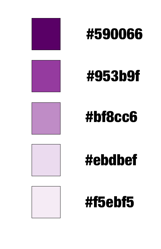
590066
953b9f
bf8cc6
ebdbef
f5ebf5